A Model to Help Medical Practitioners Predict a Patient’s Risk of Mortality
For more effective triaging of patients
By Steven Chase

While working in a hospital, there is always a lot of pressure to make prudent decisions. Afterall, the decision you make could be the difference between life and death. Ideally each patient would receive the full resources of the hospital immediately upon being admitted. However, realistically this is not the case. Hospitals have limited resources and doctors can only be at one place at a time. This requires that a level of urgency is assigned so that more patients can be successfully treated. Those with critical conditions must be seen and treated immediately, while those who can afford to, must wait. In common practice this ranking of urgency is called triage.
So how do you even begin to triage your patients? Armed with a 2.3 million row dataset sourced from the New York State Health Department, I set out to create an automated model to help practitioners quickly and effectively triage their incoming patients. Utilizing patient information that is available early in the admittance process, my model will return a calculated level of risk of mortality (minor, moderate, major or extreme). Being able to quickly determine their patient’s risk of mortality will allow practitioners to more effectively allocate both the hospital’s resources, as well as their own.
If you would rather explore the application itself, feel free to visit the website now! Otherwise, continue reading to learn about the process that went into creating the model.
Feature Selection:
The hospital inpatient dataset I used had 34 columns and 2.3 million rows. In my final model I used only 7 of these as features. Through exploratory data analysis, I eliminated unique identifiers and redundant information. For example, for each medical code there was an accompanying description. While useful for interpreting results, this was redundant information. Additionally, ‘CCS Diagnosis Code’ and ‘APR MDC Code’ contained information already captured by ‘CCS Procedure Code’ and ‘APR DRG Code’ respectfully, so they were also removed as being redundant. Considering that I wanted this model to be implemented early in the treatment process, I also eliminated columns such as ‘Length of Stay’ and ‘Total Costs’ as this data is not available until the patient has already completed treatment. I also eliminated the column ‘Severity of Illness’ as this had the potential for data leakage. Data leakage is when a feature you include in your model is directly related to the target. This allows the model to ‘cheat’ by learning about the target from this feature. In this case, the severity of the illness is directly related to their risk of mortality; naturally, as the severity of illness increases, so does the patients risk of mortality.
After cleaning the data, I ran a model using the remaining features and viewed the permutation feature importance. In short, permutation feature importance shows you the weight that a specific feature has on the predictive ability of the model. Features with higher weights are more helpful in making accurate predictions, while those with lower weights are less effective. Features can even have negative weights, meaning they are hurting the predictive capabilities of the model.
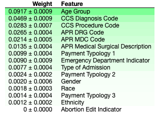
Based on the above permutation feature importance, I decided to use the following 7 features:
- Age Group
- Type of Admission
- APR DRG Code
- CCS Procedure Code
- APR Medical Surgical Description
- Payment Typology 1
- Emergency Department Indicator
Evaluation Metrics:
As this is a classification model, I chose two metrics to evaluate its performance: accuracy and weighted average f1 score.
- Accuracy tells you, out of the total number of predictions, how many of them were predicted correctly.
- The f1 score evaluates the level of precision and recall for your model. Precision tells you, out of the total predictions for a specific class, how many of them were correct. Recall tells you, out of the total number of actual values for a specific target class, how many were correctly identified as such. Since this is a multi-class target, we use the average to evaluate how the model works across all categories. Additionally, because the target class is right skewed, the weighted score is used as it helps account for label imbalance.
Comparing Models:
Having defined my target and evaluation metrics, I then set out to explore different types of models to determine which would return the highest evaluation metrics. As this is a classification problem, I chose to explore Random Forest, XGBoost and Support Vector Machine. Additionally, I explored two linear classification models: Logistic Regression and Linear Support Vector Machine.
I started by running a baseline model to determine the null accuracy and f1 score. That is, the evaluation scores if we were to guess that every patient had a classification of minor risk of mortality (the most frequent target class).
Baseline:
- Accuracy: 0.57
- Weighted Average f1 score: 0.41
Below are the best results obtained by each model type I experimented with:
To view the actual modeling, please visit my GitHub.
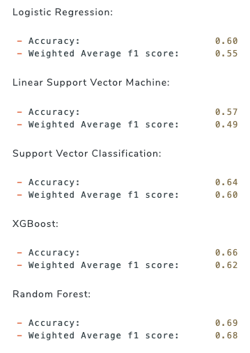
The Random Forest model gave the best results with an accuracy of 0.69 and a weighted f1 score of 0.68. While there is room for improvement, as future iterations can include feature engineering as well as techniques to deal with imbalanced target classes, the Random Forest model provided significantly better scores than the baseline model did.
Insights:
Besides the predictive capabilities of the model, we can also draw further insights by looking at how the features interact with the model and with each other. As we mentioned already, the permutation feature importance captures the weight of the effect that each feature has on the model’s prediction. However, it doesn’t tell us anything beyond that.
Partial Dependence Plots
For more insight, we can use partial dependence plots (PDP). A single feature PDP shows how one feature effects the probability of being categorized for each target class. A two feature PDP shows how two specific features interact with the model and its predictions.
The single feature PDP below shows the interaction between ‘Age Group’ and the target class.
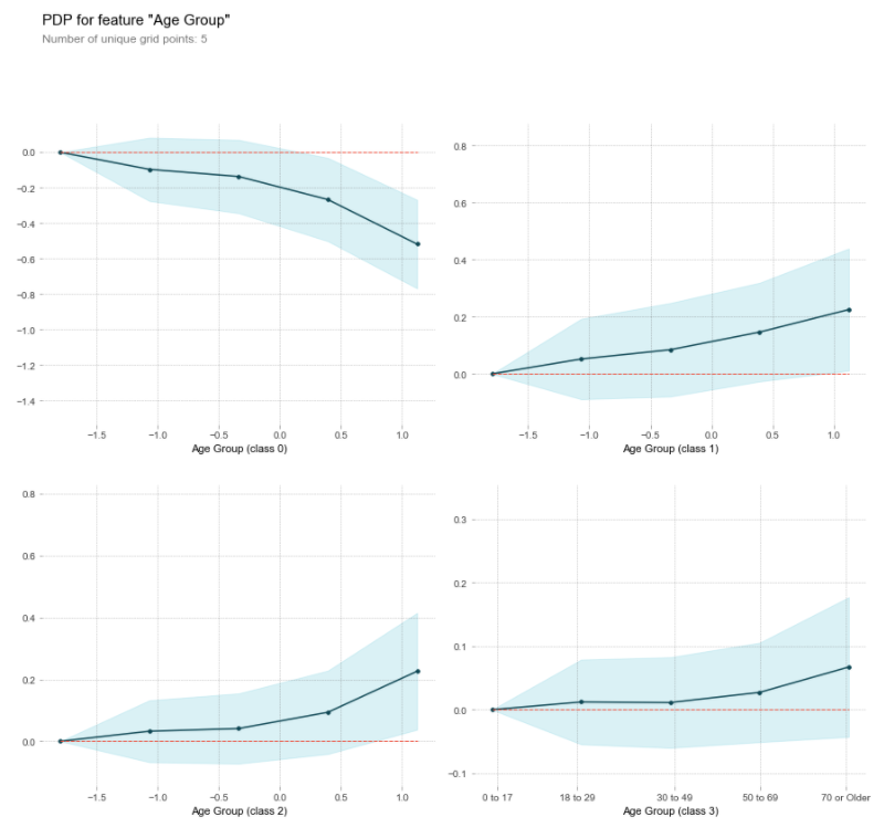
This clearly shows us that as age increases, the probability of being classified as having only a minor risk of mortality decreases while it increases in all of the higher risk categories.
Shapley Values
Another very useful visualization that shows us how a specific prediction was made for an individual observation is the Shapley values. It will tell us both which direction and how strongly each feature pushed the probability for classification for each target label.
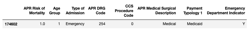
Given a random test patient’s information:
Let’s examine the resulting Shapley Values plot below:
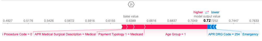
Shapley values for Minor Risk of Mortality:
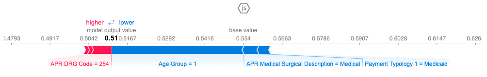
Shapley values for Moderate Risk of Mortality:
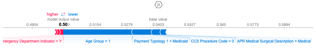
Shapley values for Major Risk of Mortality:
Shapley values for Extreme Risk of Mortality:
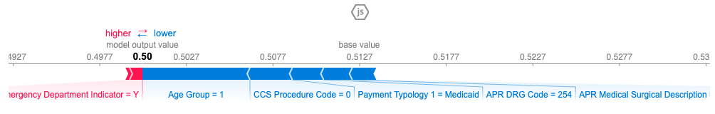
The red arrows are the features that push the probability for that class higher, and the blue arrows push the probability lower. The length of the colored bar is the amount of impact the feature had on influencing the prediction.
For this individual, the class with the highest probability (0.72) was the ‘minor risk of mortality’. Therefore, the model predicted that this specific patient would have a ‘minor risk of mortality’. This prediction matched the actual records, so the model predicted correctly. As you can tell, the factors that increased the probability that this patient had only a ‘minor risk of mortality’ were that the individual was young, paid with Medicaid, was a medical admittance (opposed to surgical) and did not undergo a procedure (CCS Procedure 0). Some features that lowered the probability of it being a ‘minor risk’, (meaning increased their risk) were; that it was an emergency department admittance and that it was a digestive system diagnosis (APR DRG 254).
In Closing:
While the purpose of creating the model is for its predictive powers, analyzing the results should never be taken lightly. There is so much to be learned from examining which features the model relies on and how they interact. For example, my prior assumption was that gender or race (whether because of being susceptible to different diseases, or due to any biases in the medical system) would have a larger impact than they did. It was surprising to uncover that the method of payment had an impact on the risk of mortality. Why is that? Does the level of treatment vary based on how they pay? Does paying with certain methods mean they cannot afford to stay in the hospital as long and therefore suffer the consequences? Do certain methods of payment speak to something personal that inherently increases or decreases their risk of mortality? That is an interesting avenue to explore with potentially profound ramifications that could have real impacts on the healthcare system. Without utilizing tools such as partial dependence plots and Shapley values, you won’t be able to examine what your model is doing under the hood which proves invaluable to your understanding of the problem you set out to solve in the first place.
Visit the application to get predictions of your patients’ risk of mortality.